
$ cd ~/talks/three-things-about-css
Three Things You Might Not Know About CSS
Browsers read selectors right to left, CSS can count, and the Fab Four technique makes emails responsive without media queries.
$ open slides














$ cat notes.md
An internal tech share at REDspace, and an excuse to talk about CSS for half an hour.
1. Browsers read selectors right to left
In .card__body .card__body--red, the browser matches .card__body--red
first. If the rightmost part doesn’t match the element it’s looking at, the
whole rule can be skipped quickly. That wasn’t always how it worked, and
browsers do a lot more today to make matching fast.
Which leads to two habits:
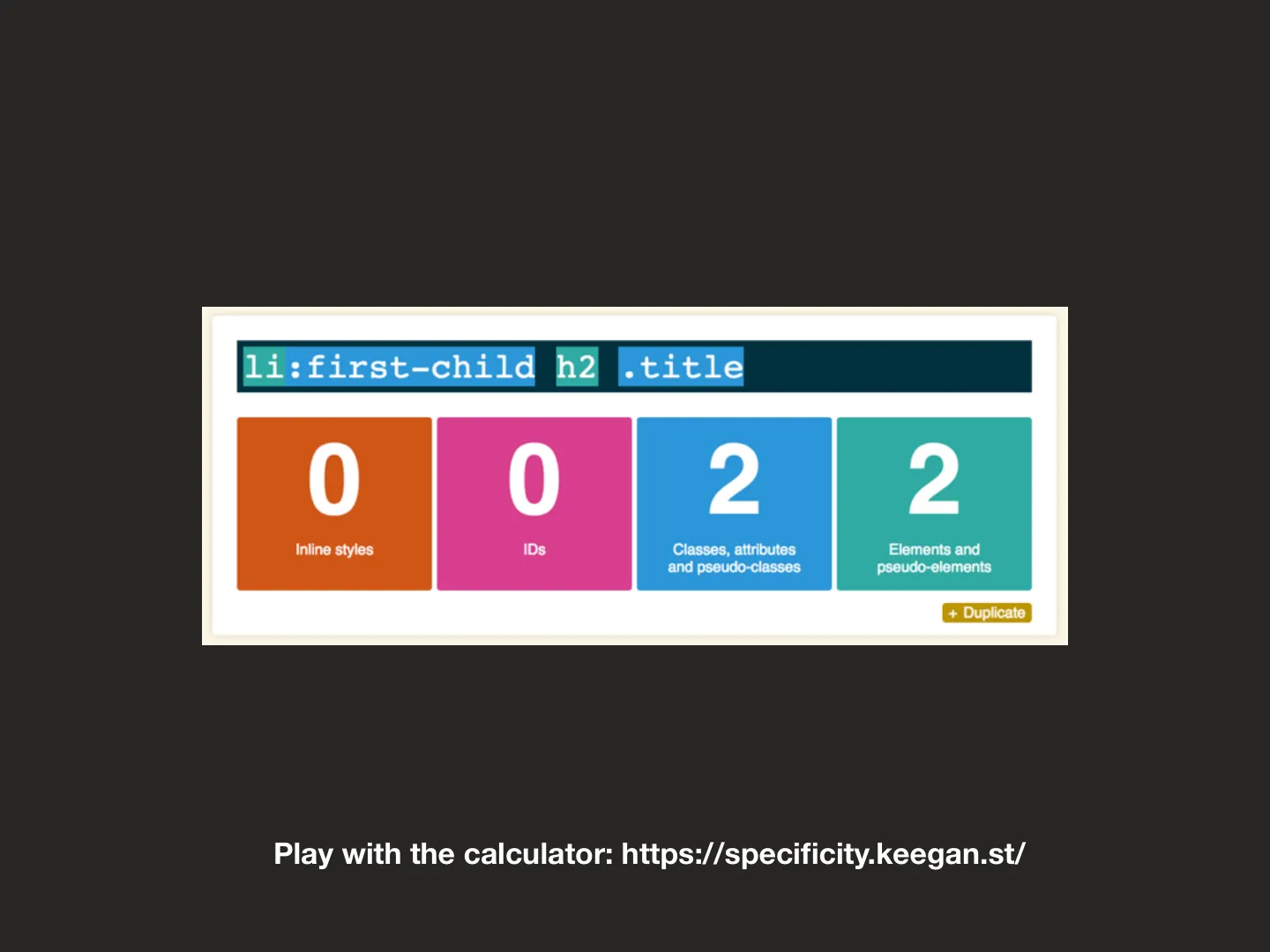
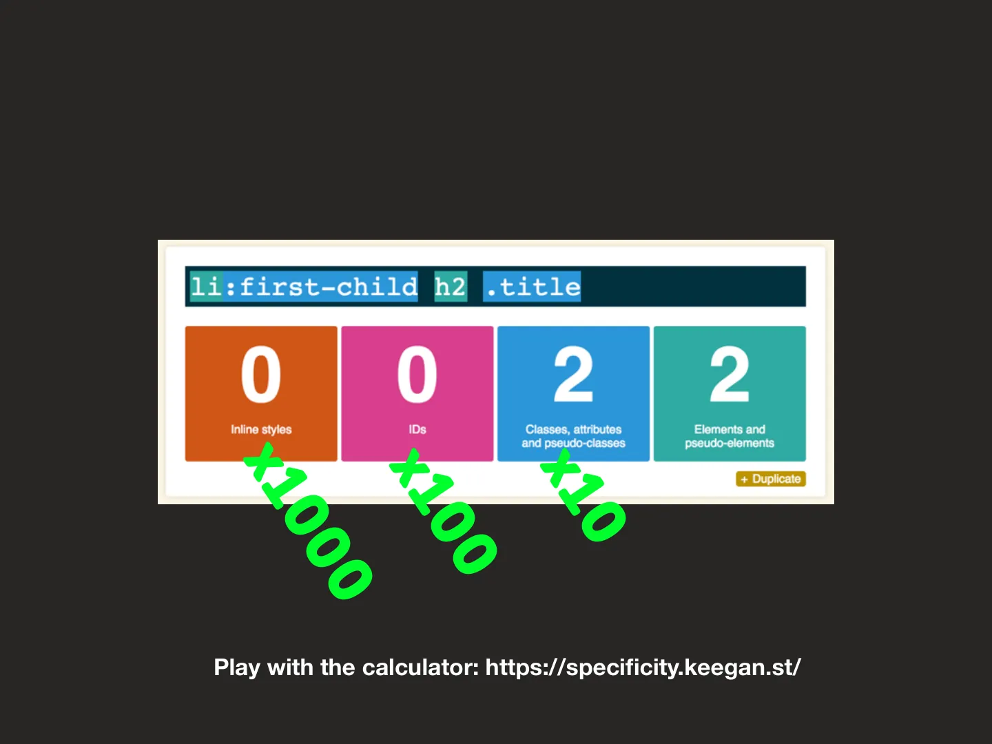
- Don’t use IDs in CSS. An ID outweighs any number of classes, so specificity gets away from you fast. Play with the specificity calculator.
- Keep selectors short. In Sass,
@at-roothelps you nest without the output piling up. Harry Roberts has a good post on keeping CSS selectors short.
2. CSS counters
CSS can count for you:
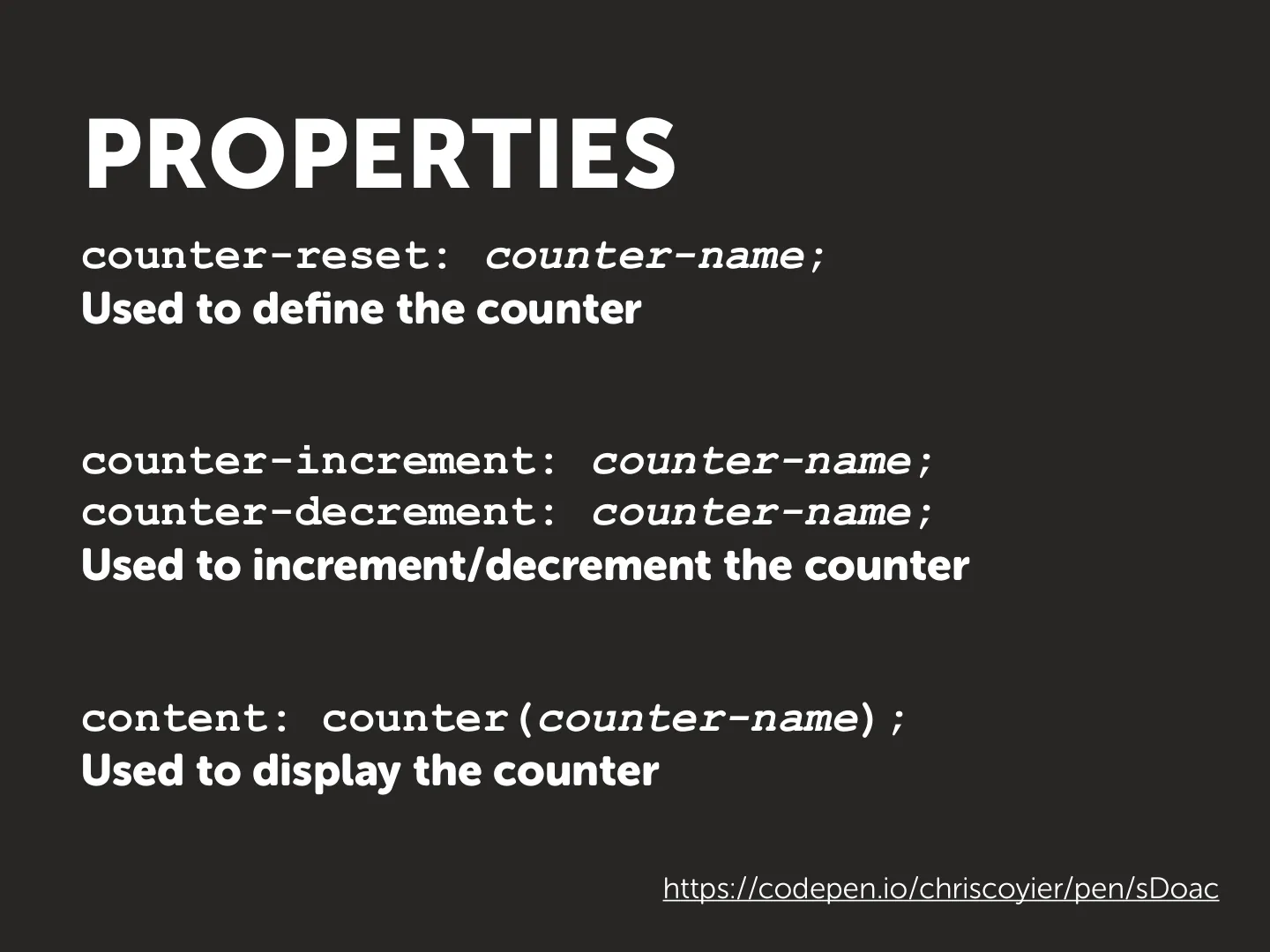
counter-reset: name;defines a counter.counter-increment: name;steps it.content: counter(name);displays it.
They can also react to the page: count checked checkboxes and you’ve got a score with no JavaScript. A couple of fun demos from CodePen: Chris Coyier’s counters and Alex Erlandsson’s.
3. The Fab Four
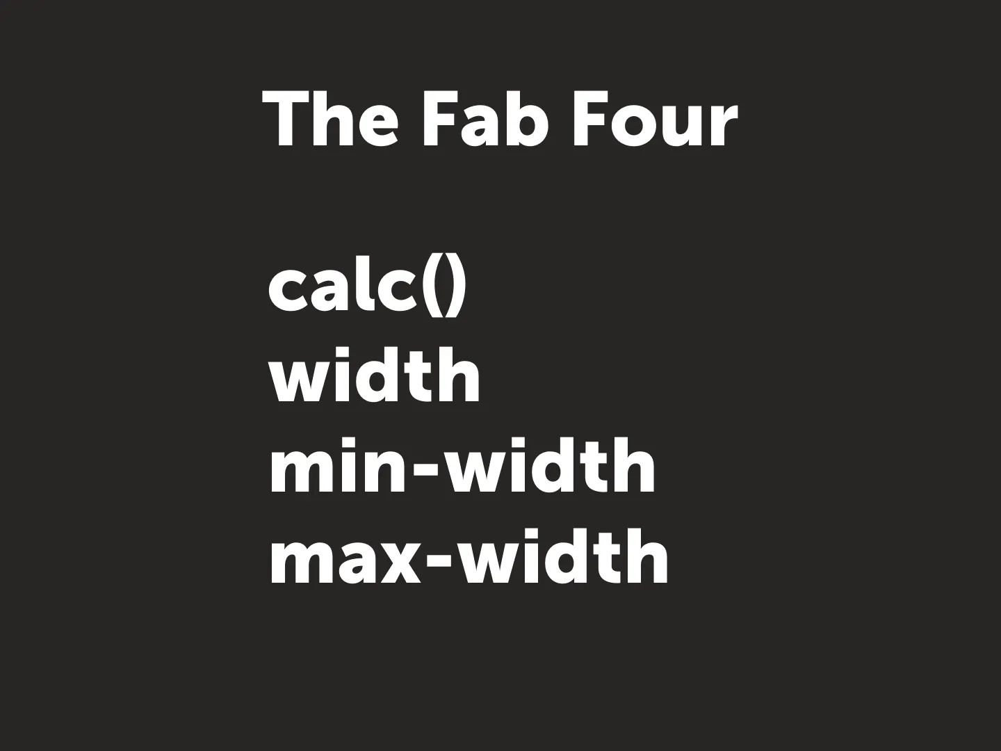
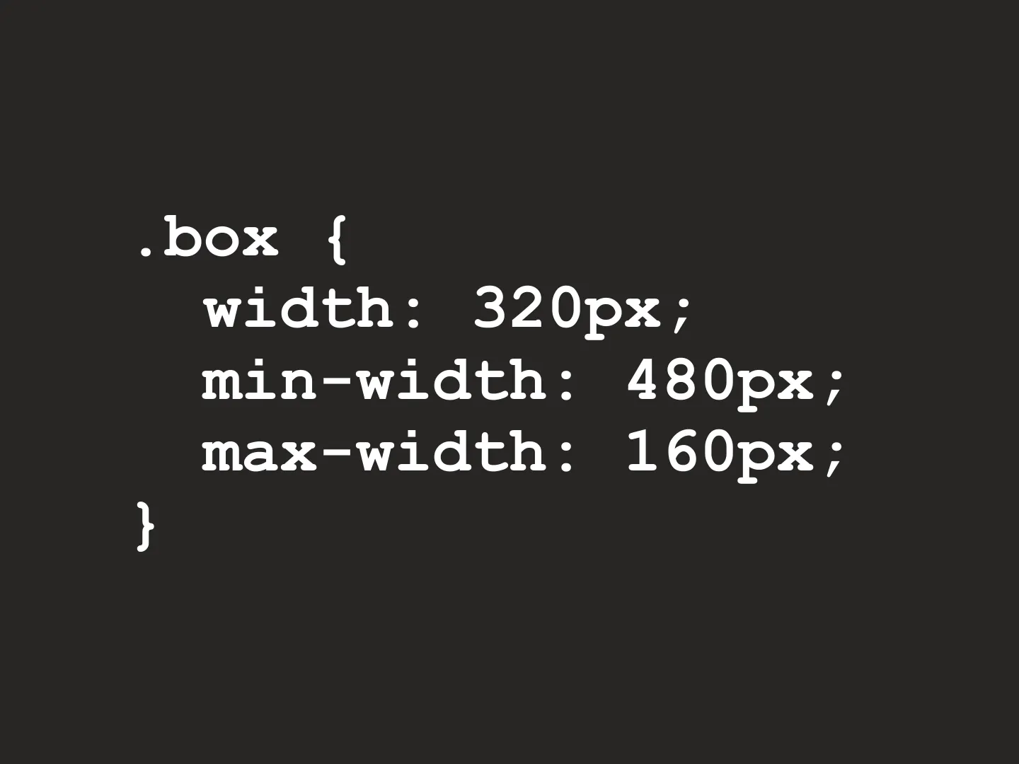
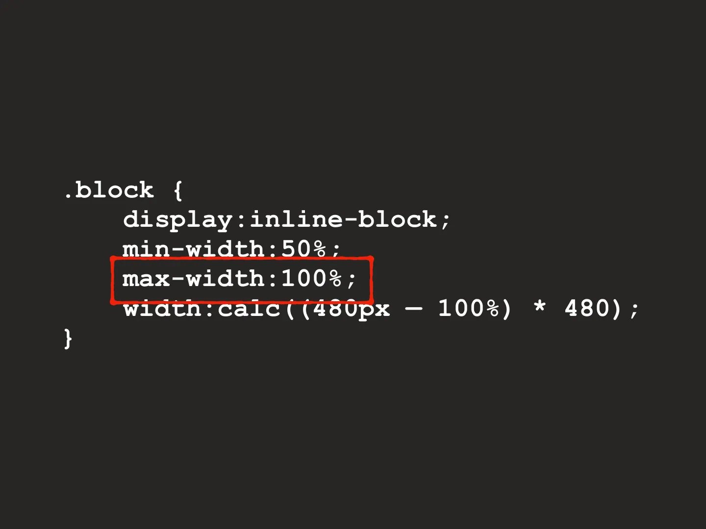
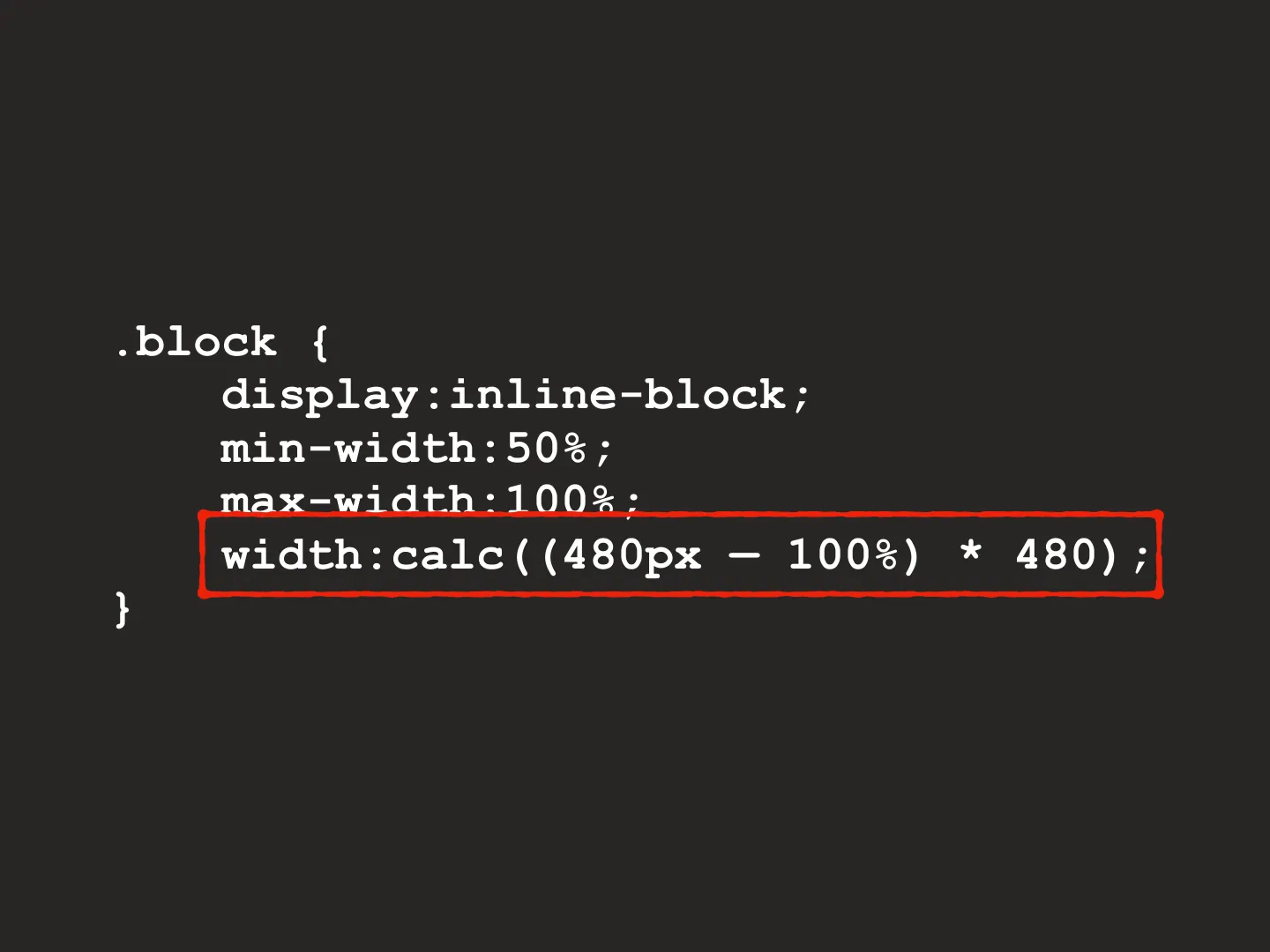
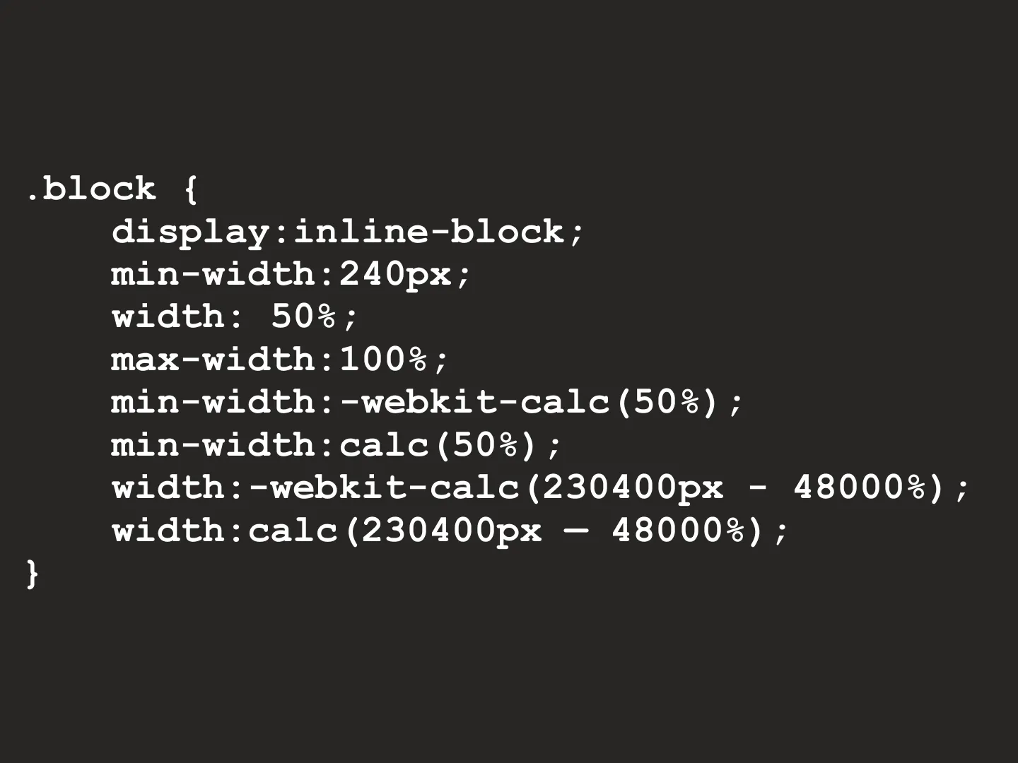
calc() plus width, min-width and max-width. The rules when they
disagree:
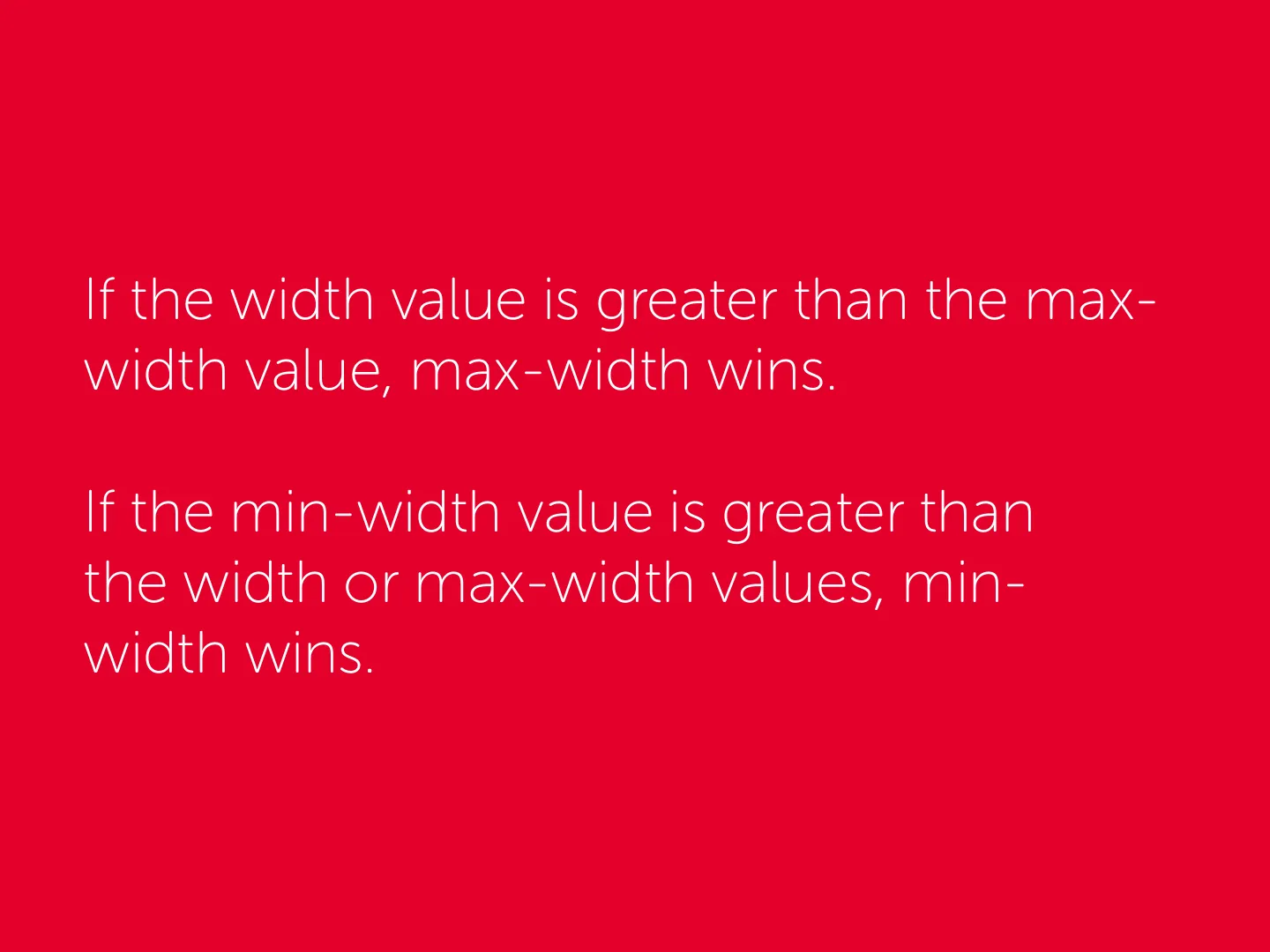
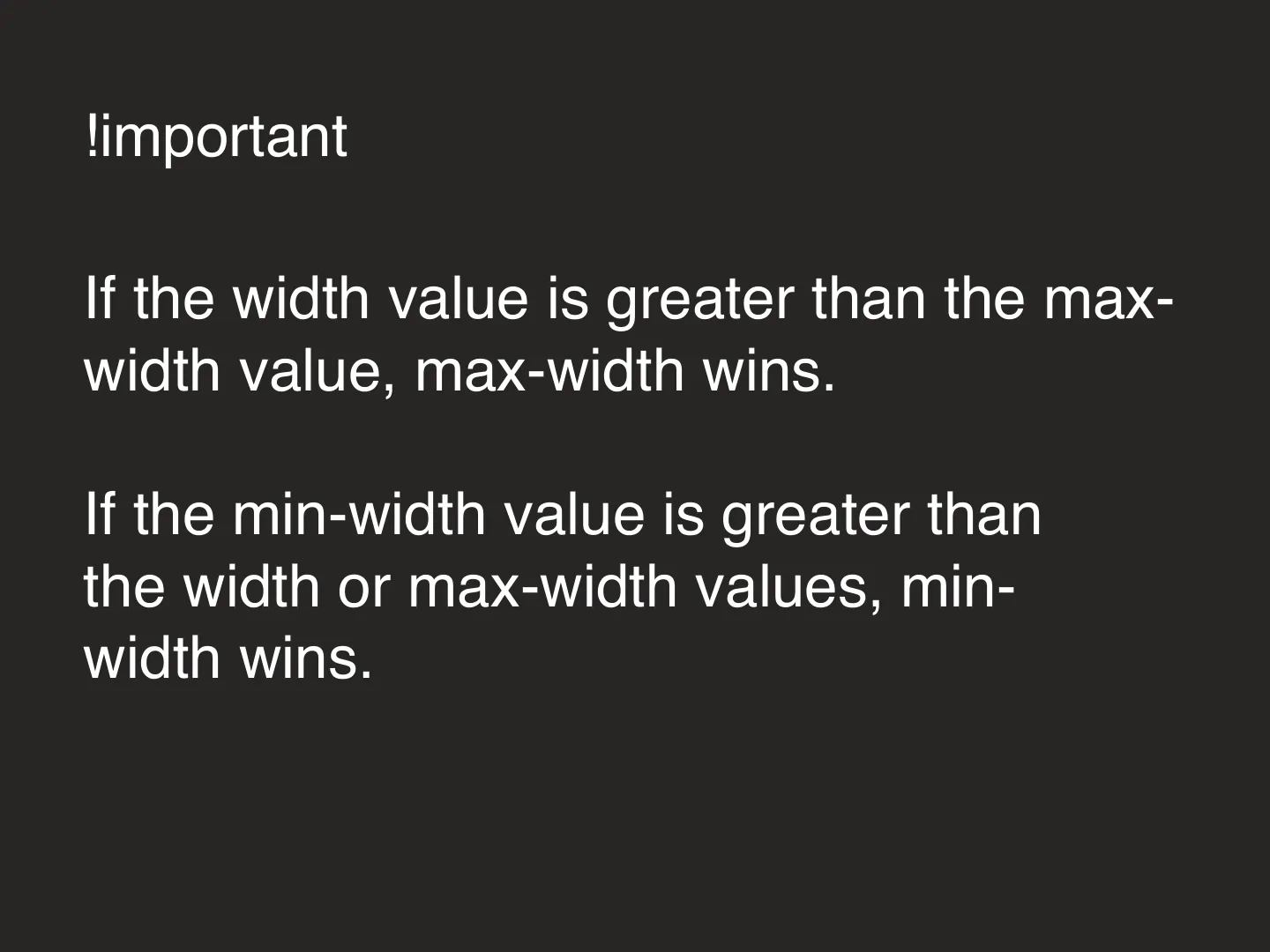
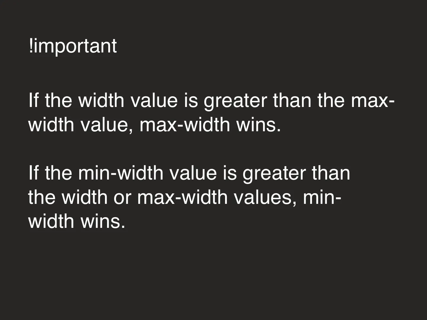
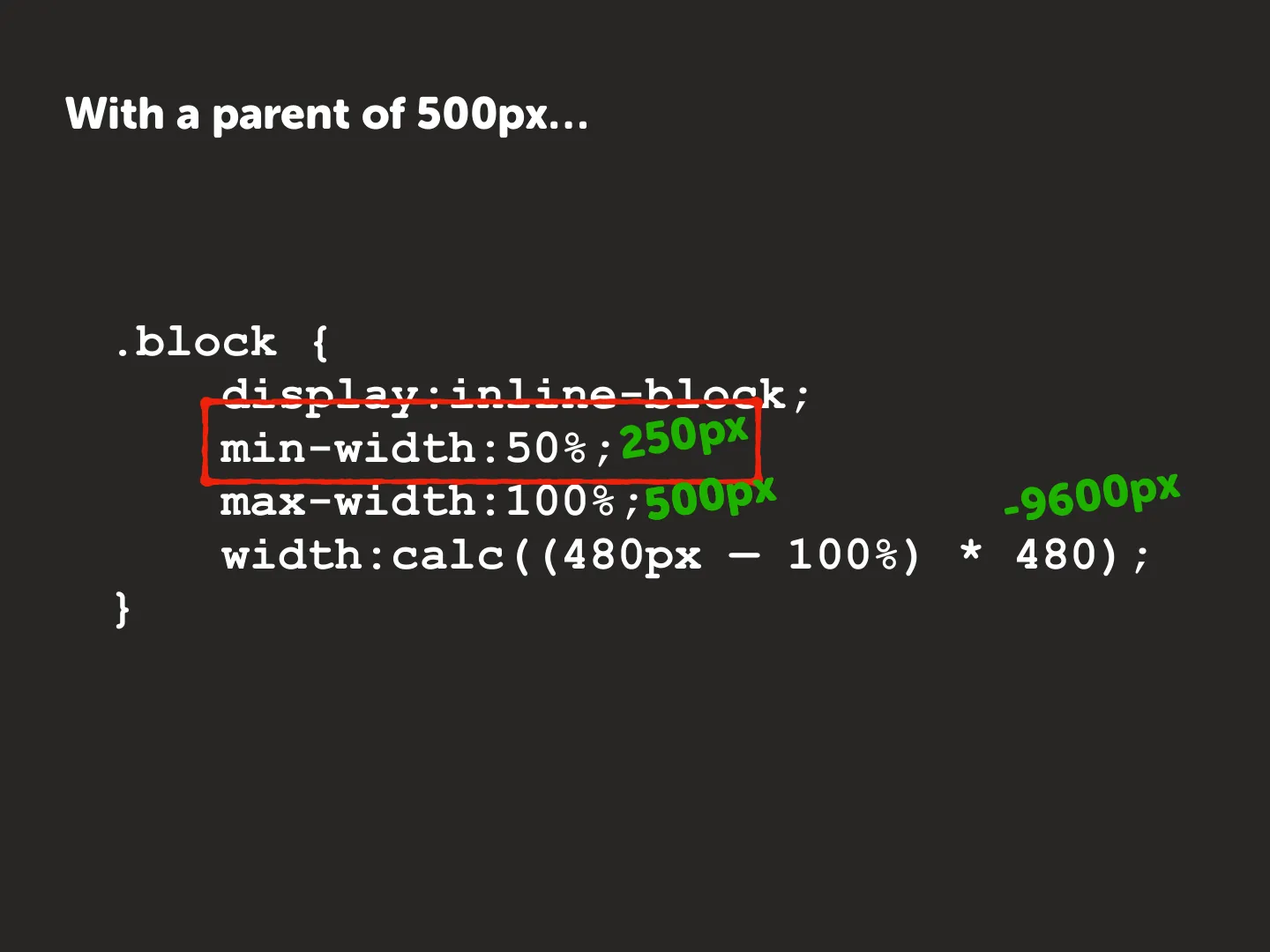
- If
widthis greater thanmax-width,max-widthwins. - If
min-widthis greater thanwidthormax-width,min-widthwins.
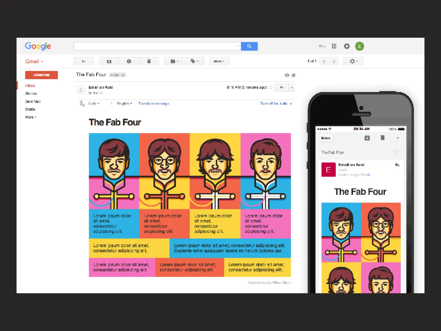
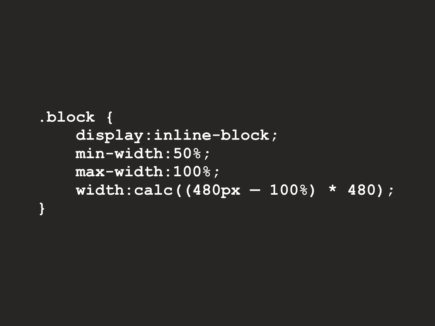
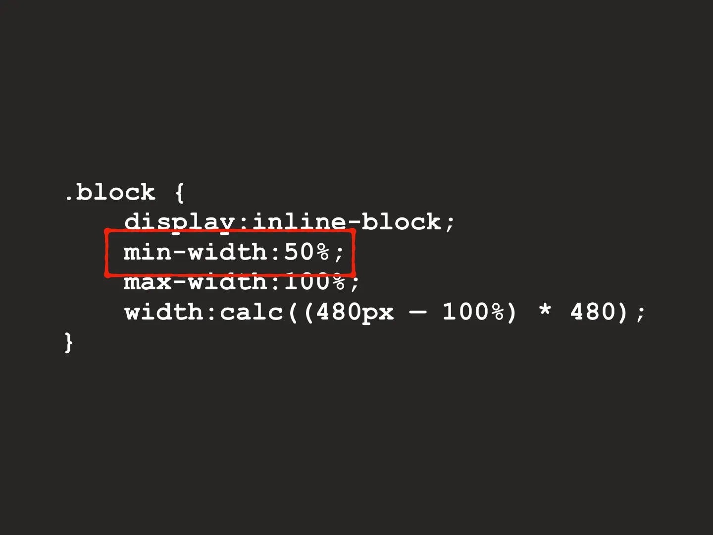
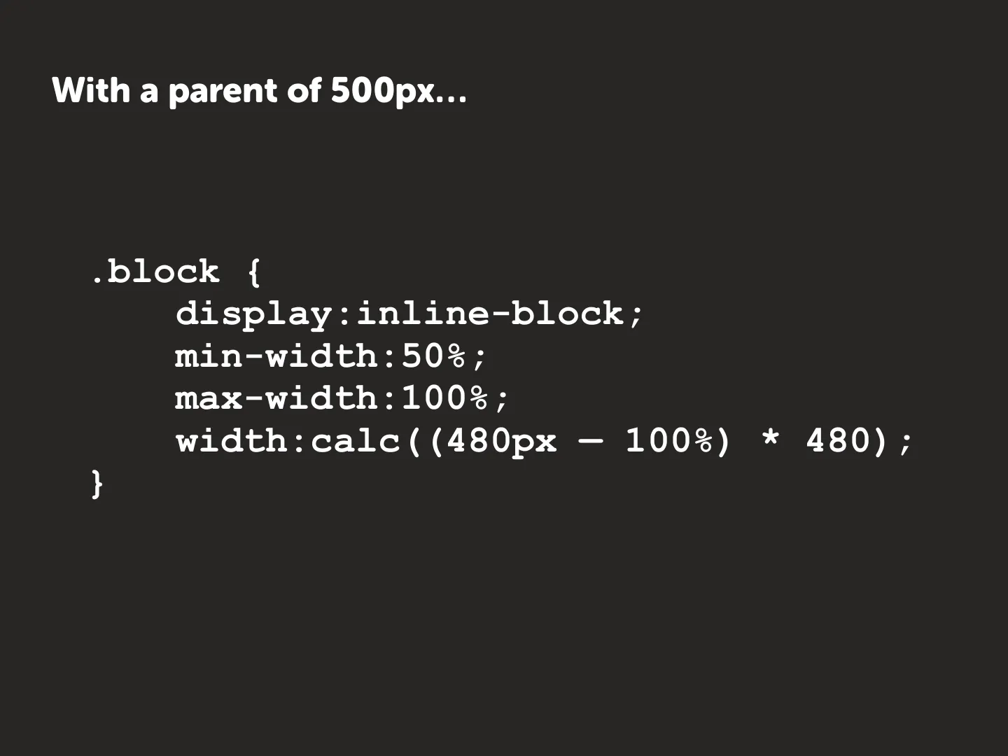
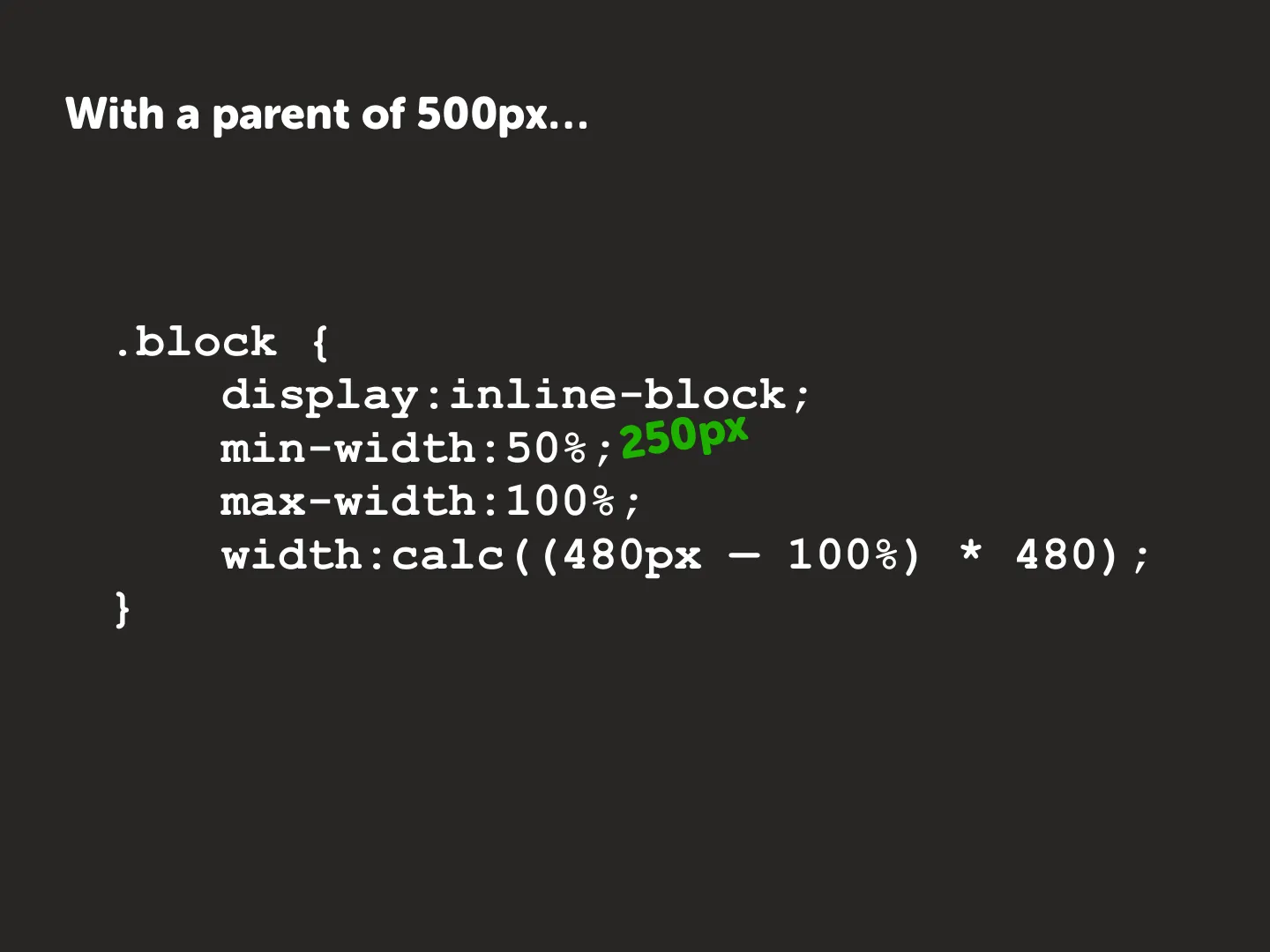
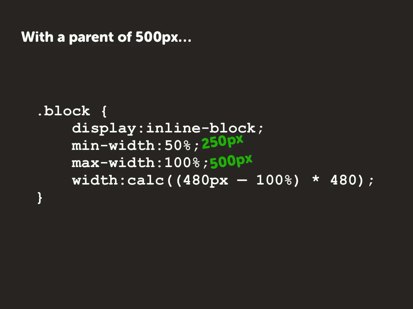
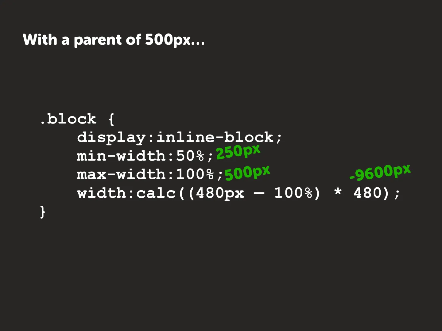
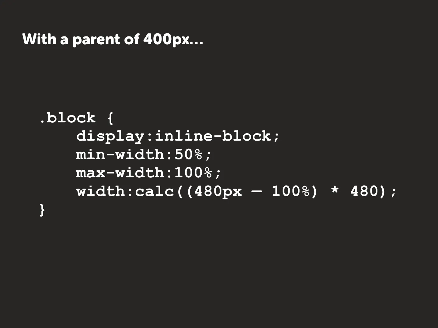
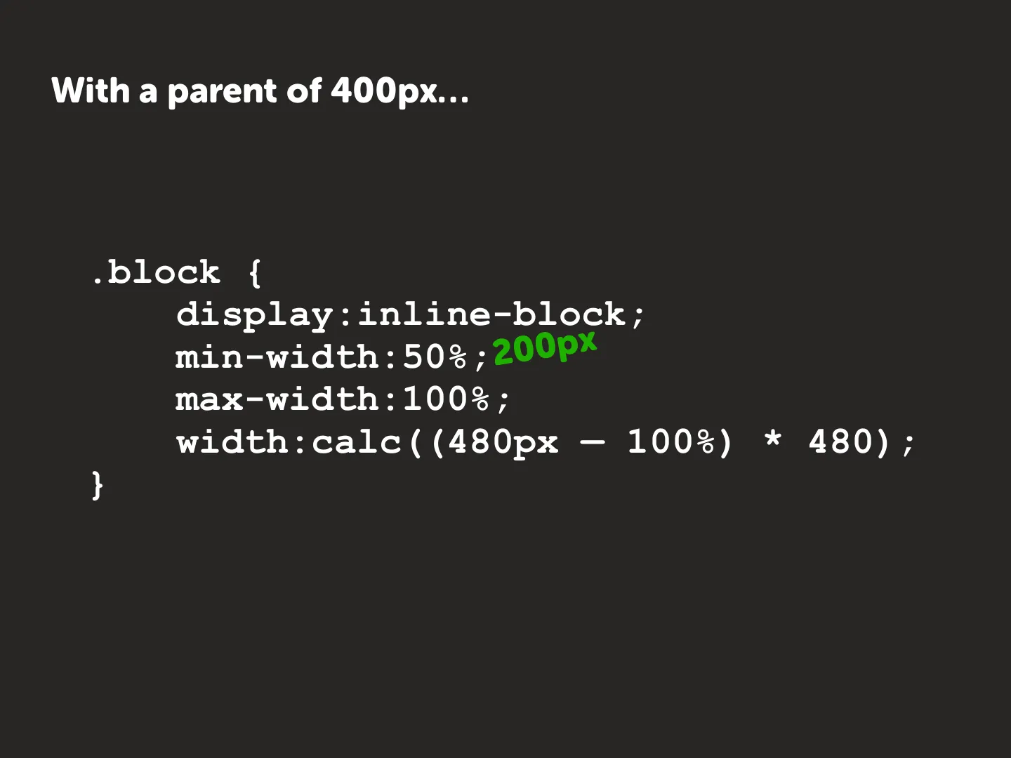
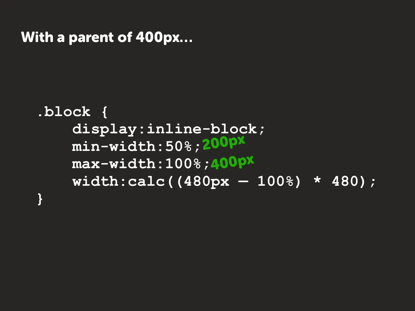
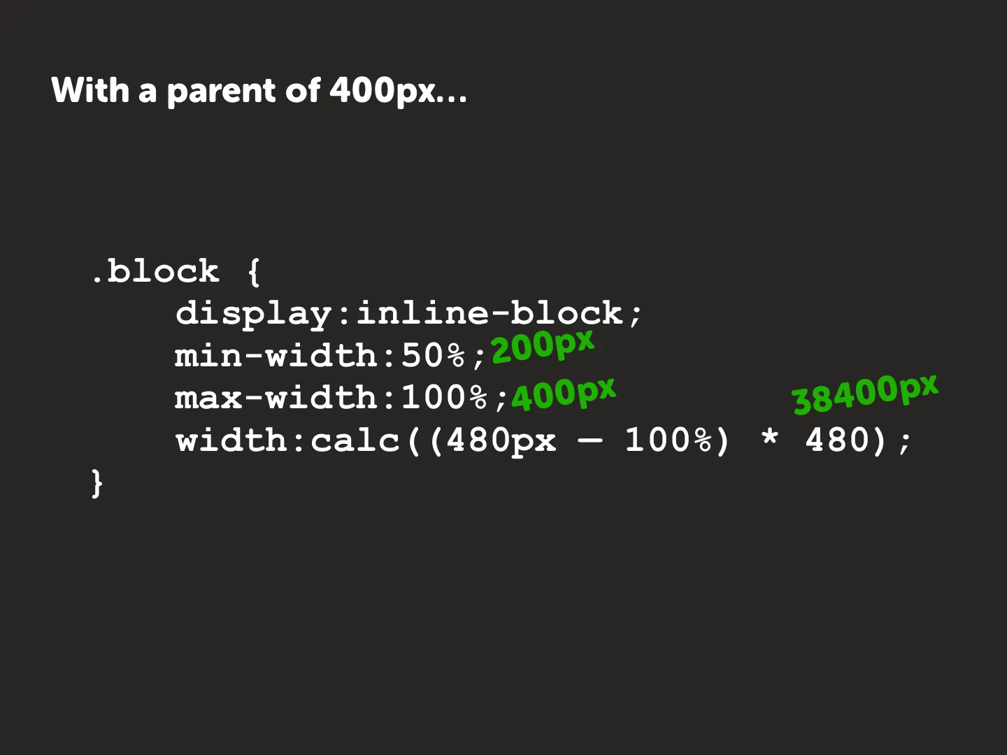
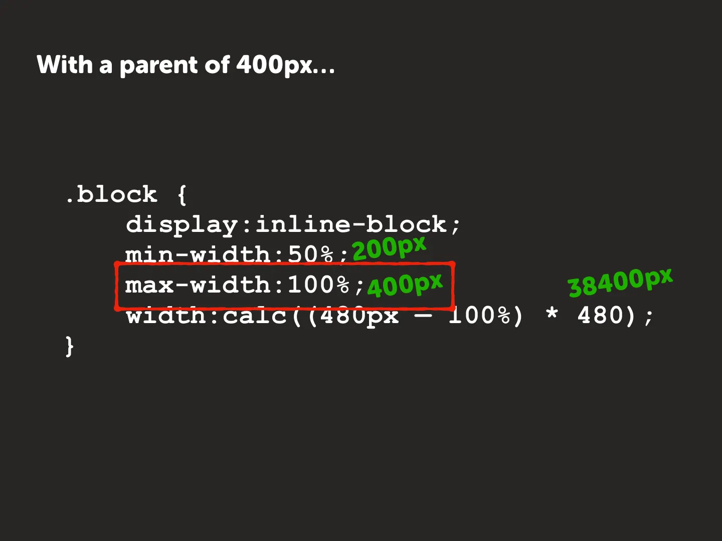
So with width: calc((480px - 100%) * 480), a 500px parent gives a huge
negative width and min-width: 50% wins (two columns). A 400px parent gives a
huge positive width and max-width: 100% wins (one column). That’s a
breakpoint at 480px with no media query, which matters in email clients that
ignore them. Here’s
the Fab Four demo.
Quirks to watch for: old Outlook.com, calc() support, the Outlook web app, and
WebKit prefixes.